
PRINT BOOKS
Introduction
Reading is a gateway to many kinds of learning – for study, for pleasure, for community building. There is no one way to experience reading; no checklist that works for everyone. If publishers are committed to “born-accessible” books, then reading should be available and accessible in the format that works best for every individual.
Reading a print book can be impossible for someone with a print disability who can't see the words, or turn the pages, or comprehend the material. Their choice of format may depend on an individual's degree of vision loss or range of physical motion, their reason for reading, comfort level with technology, and preference for either a synthetic or human voice.
Accessible Print Books
The Royal National Institute for Blind People (RNIB) recommends a variety of adaptive reading technologies for print books, including handheld magnifiers, large print, and braille. While most print books aren't typically translated into braille, the RNIB offers over 60,000 braille translations to their members for lending and purchase. Larger publishers like Penguin Random House, HarperCollins, and Simon & Schuster have large-print collections, but both braille and large print are not often available through independent publishers owing to their more limited budgets.
House of Anansi translated the 2019 Griffin Poetry Prize winners into both digital and print braille. In 2020, Coach House Books published Amanda Leduc's Disfigured: On Fairy Tales, Disability and Making Space in paperback, audiobook, PDF, and EPUB. Leduc's book is also available in e-braille, print braille, and DAISY audio, thanks to a partnership with the Centre for Equitable Library Access (CELA) and the National Network for Equitable Library Service (NNELS).
The Centre for Equitable Library Access (CELA) has tools and techniques for people with print disabilities so they can adapt their reading.
If it is difficult to see text or images or focus or move the eyes:
- Magnify print materials.
- Scan print materials and convert to e-text.
- Manipulate e-text using adaptive software (zoom, highlight, convert to speech or braille).
- Listen to an audio version.
- Read by touch (braille and tactile images).
- Watch video with an audio description of on-screen action (descriptive video).
If it is hard to hold or manipulate print materials:
- Use an assistive device to turn pages.
- Read e-text or listen to audio using adaptive software.
- Use a book chair or holder to hold the book.
- Use a device that requires limited motion and strength to operate (Switch access allows people with limited mobility to interact with various communication and mobility devices).
If someone has a learning disability including understanding text, dyslexia, recognizing common words, or interpreting visual information:
- Manipulate e-text using adaptive software, use text-to-speech, use Open Dyslexic Font, highlight phonemes, words, or sentences as you read).
Dyslexia
Dyslexia is a neurological condition that affects reading accuracy, reading fluency, and spelling. People with dyslexia may read slowly and make mistakes, which can impact reading comprehension as well as spelling, writing, and math. Dyslexia is a language issue, not a vision issue, and impacts different people in different ways. Multidisciplinary designer Daniel Britton has created a typeface that shows how some people with dyslexia see text.
The British Dyslexia Association has created a style guide for written materials that facilitates easier reading for people with dyslexia. Suggestions include:
- Using sans serif fonts such as Arial and Comic Sans as the letters appear less crowded. Alternatives include Veranda, Tahoma, and Calibri.
- Avoid underlining and italics as they can make text look crowded.
- Use bold for emphasis.
- Avoid uppercase and small caps, which can be less familiar and harder to read
- Use dark text on a light, but not white background. Consider cream or pastel.
- Don't use glossy paper as glare can make text hard to read.
Reading skills can improve for people with dyslexia, and a few dyslexia-friendly fonts have been developed to help with reading. While there is no scientific evidence that these fonts make a difference, there are features that might make reading more comfortable for some people. The letters of dyslexia fonts have some thicker lines and are slanted a bit. Letters with sticks and tails (b, d, and p) vary in length so they can be easily differentiated (Understood, 2022).
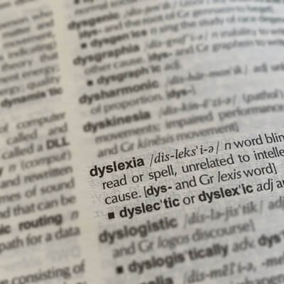
Image source: Rob Hobson/Unsplash
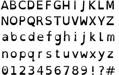
Image source: opendyslexic.org
OpenDyslexic font is an open-source font that's free for personal and business use, education, commercial, books, e-readers, applications, and websites to help increase readability for people with dyslexia. The typeface includes regular, bold, italic, and bold-italic styles, and is continually updated and improved based on input from dyslexic users. Letters have heavy, weighted bottoms to indicate direction, which also helps reinforce the line of text. The unique shape of each letter ensures that each character is distinct so there's no confusion as to which is which. OpenDyslexic comes pre-installed on several popular reading apps and devices, including those made by Amazon and Kobo. Other font options include Read Regular, Dyslexie, and Sylexiad.
Dementia and reading

Image source: Brandi Reddy/Unsplash
A 2018 study published by JAMA Psychiatry indicates that a regular reading schedule helps to improve memory, preserve language, and decrease dementia risk in older adults. According to researchers, dementia risk was significantly lower among those who participated daily in intellectual activities like reading books, magazines, and newspapers, as well as playing board games. After a dementia diagnosis, it's important to continue reading to stave off further memory loss, as well as to build and maintain connections with family members and care workers. Many people with dementia retain their ability to read but may lose focus or become tired easily. They may quit reading because of the effort involved in keeping the thread of the story.
JAMA Psychiatry has the following recommendations for those with dementia and their helpers for encouraging reading:
- Read alongside people with dementia.
- Choose books with photos or images and clear, large text.
- Humour is a preferred genre.
- When reading, write down notes about the plot for easy review.
- Make sure books and newspapers are available.
- Write daily notes for those with dementia in short and clear handwriting.
In 2018, occupational therapists at the ACE Alzheimer Centre in Barcelona, Spain initiated a group reading activity at their drop-in centres for people with mild dementia. At the beginning of each session, a story was reviewed and repeated to remind listeners of the plot, thereby reducing frustration. Notes were taken about key plot points so readers could refer to their notes to remind themselves of the story. Facilitators found that short, easy to read humorous novels better engaged their members.
Recommended reading materials vary for people at different stages of dementia. For those with mild dementia, short novels and stories or newspaper or magazine articles are generally best. Short poetry is recommended for people in moderate stages of dementia, while for people in the advanced stage of dementia, familiar statements or proverbs and books with visual imagery - organized by colour, shape, or theme, can help stimulate memory or calm the senses (Being Patient, 2019).
Books that incorporate text and images can help readers retain focus. In a 2016 study, researchers at Essex Meadows Health Center (EMHC), in Essex, Connecticut worked one-one-one with long-term care residents in developing a prototype for text that eased the effort of reading. Considerations included graphic design, typeface, syntax, visual contrast, and subject matter.
- Interspersing clear, intriguing photographs reflecting the content of the corresponding page sustained a reader's focus.
- A title in bold print placed above a relevant photo on one page and 10-15 lines of text with ample margins on the facing page became the basis of the format.
- Enhancing a resident's independent reading by optimizing the environmental, postural, lighting and book placement factors.
The residents and researchers suggested coaching for family members on how to engage in interactive reading. Researchers discovered that encouraging reading in pairs and small groups enhanced spontaneous conversation between readers and the residents became less dependent on staff.
Building on the success of the reading groups, the Reading2Connect program was developed. Reading2Connect provides specially created books, in both print and digital formats, for adults living with dementia and other cognitive changes. It also provides training for caregivers, so that more people can connect with printed texts, and therefore with each other (Reading2Connect, 2022).